CRYSTAL DRUM PICTURES
Here are some drawings and cartoons we've run in Crystal Drum over the past couple of years. Black and White drawings with a thick line and a minimum of shading are by far the easiest thing for us to reproduce.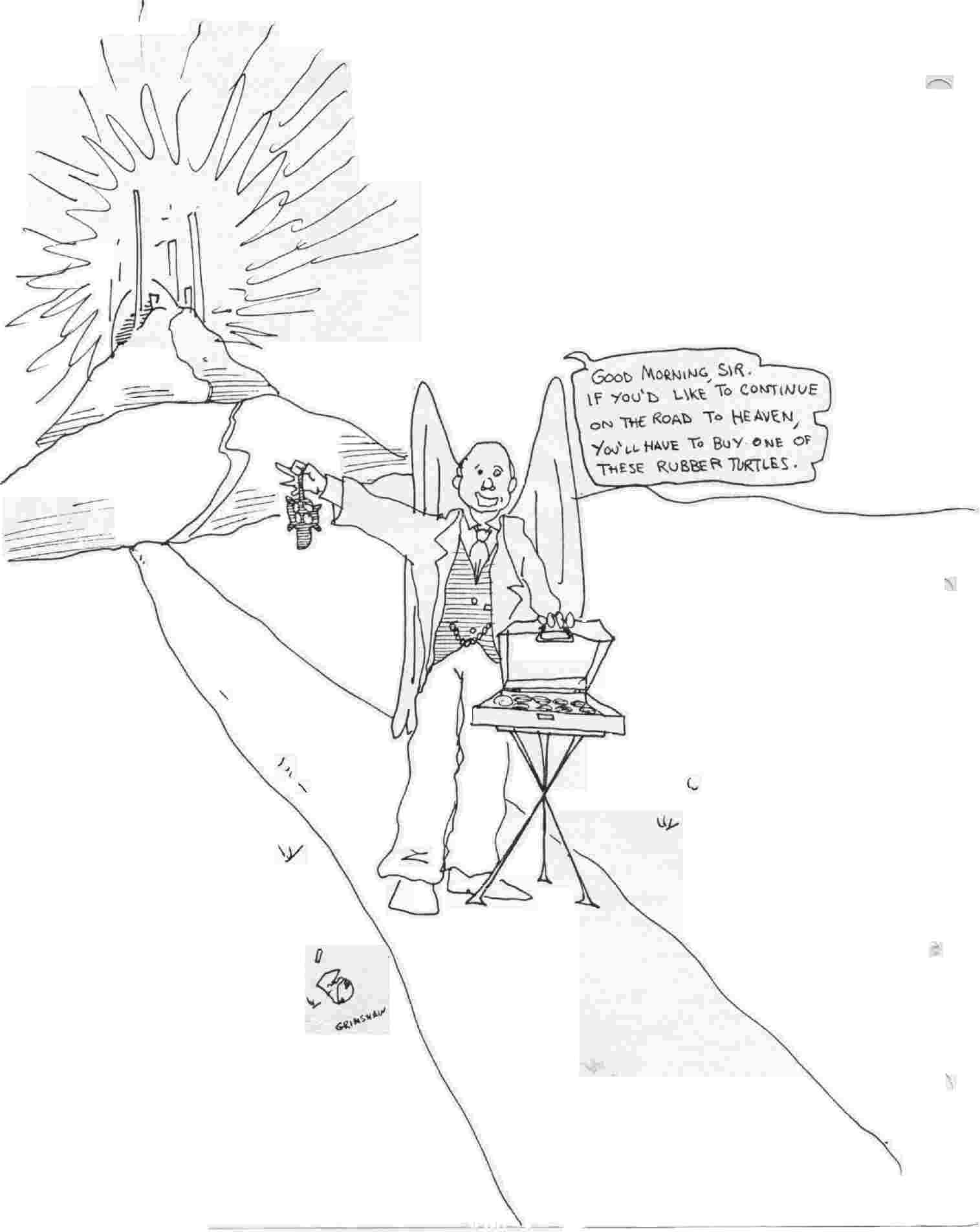 This cartoon by *ahem* me, which originally appeared in Sam Helm's "NOTES" zine back in the eighties, was pressed into service as the back cover of Crystal Drum 70 when the drawing we were expecting didn't show up by deadline. The quality of the line is just about the minimum of what we can accept without driving the local copy shop nuts. The 'wash' effects were all pretty much lost when the drawing was reproduced. This wasn't crucial since the cartoon doesn't really depend upon them, but it's something to keep in mind. It's not that we don't appreciate subtlety-- it's just tough to repro.If you're going to get fancy, cross-hatching is more likely to make it intact through our scanner (and the copy shop's Xerox machine)than wash or pencil shading. The original drawing was 8 X 11, and a larger picture is generally better for our purposes-- we can shrink with more success than we can enlarge-- though once again, line drawings tend to look pretty good even blown up slightly. And another thing to bear in mind is: we are suckers for cartoons about rubber turtles, even when we didn't draw them ourselves. (If you can't read the word ballon, rest your cursor on the image).
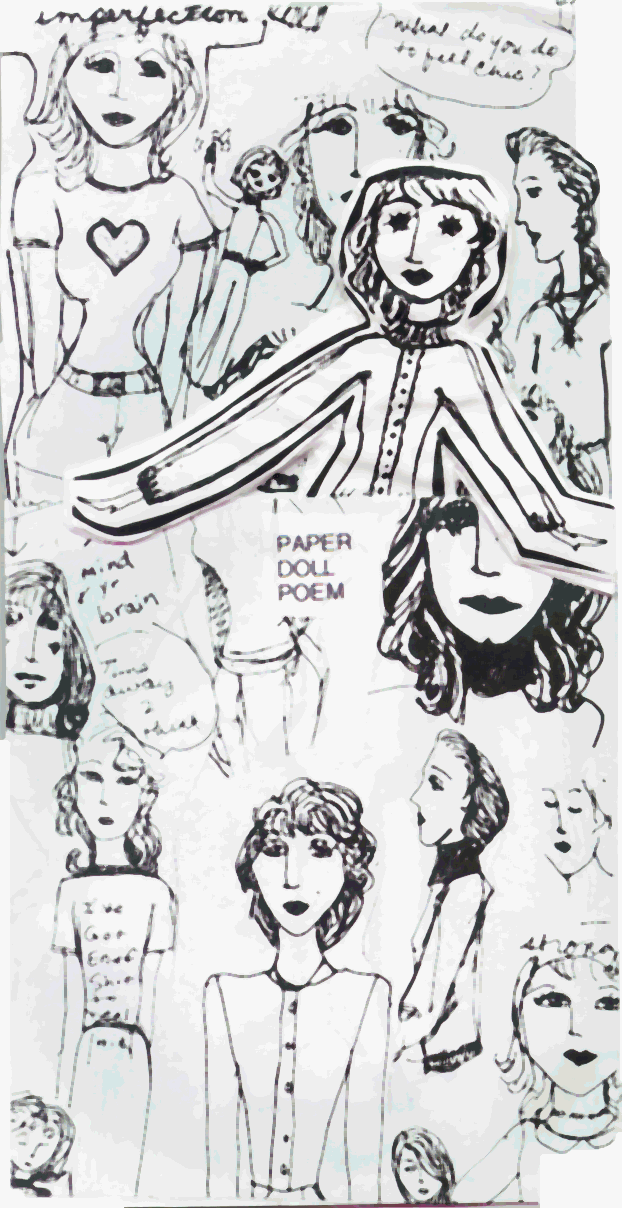 The image to your right-- and as good as it looks, what you're seeing doesn't do justice to the original, we had to crunch it like mad-- is a paper construction by Jennifer Stanley using all sorts of shading techniques that repro only with great difficulty. So if you MUST go crazy, and we like it enough, we'll go the extra couple of miles. The reproduction in the actual magazine came out pretty good, especially in the contributor copies which were run right off the computer, but again, the original is a lot cooler.
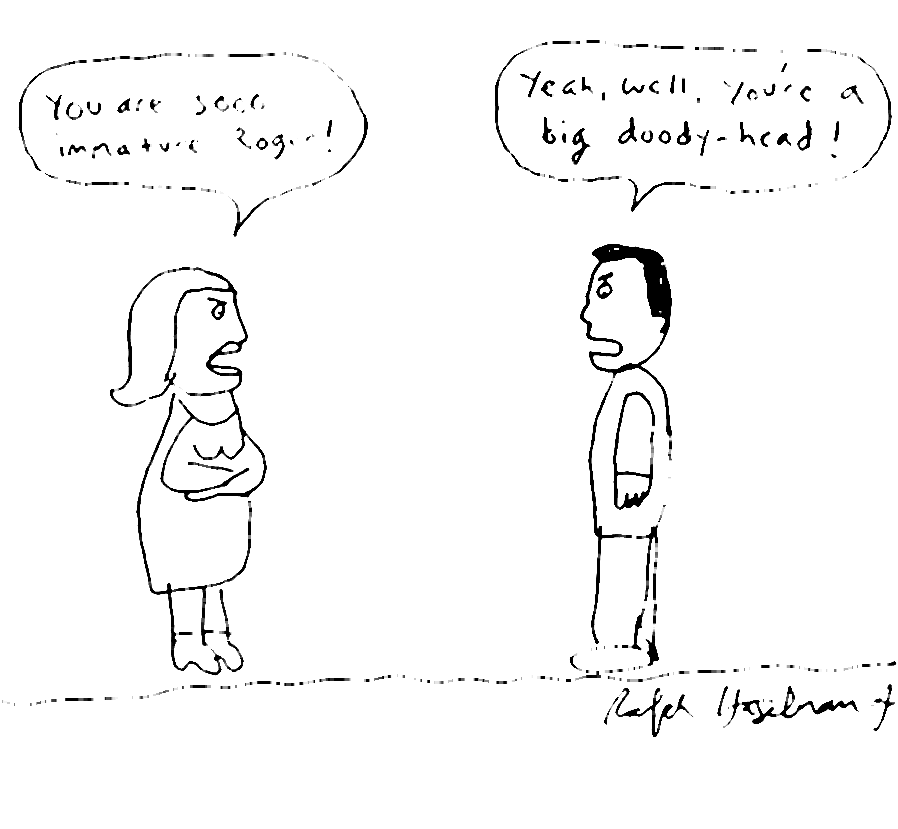 In the best of all possible worlds every cartoon we print would be both really funny and a treat for the eyes. In this world, we will occasionally settle for funny, as we do in this case, one of several cartoons we've run by Ralph Haselmann, Jr. Ralph commits virtually every aesthetic offense a cartoonist can commit here -- even the writing in the word balloons is almost unreadable (rest your cursor on the image to find out what everybody is saying). But we thought it was funny, so... Anyway, Ralph's style has grown on us, and now we're at the point where we actually think his stuff looks charming. It's got pizzaz. Or maybe we're just ready for a rubber room. Why do I keep saying "we?"
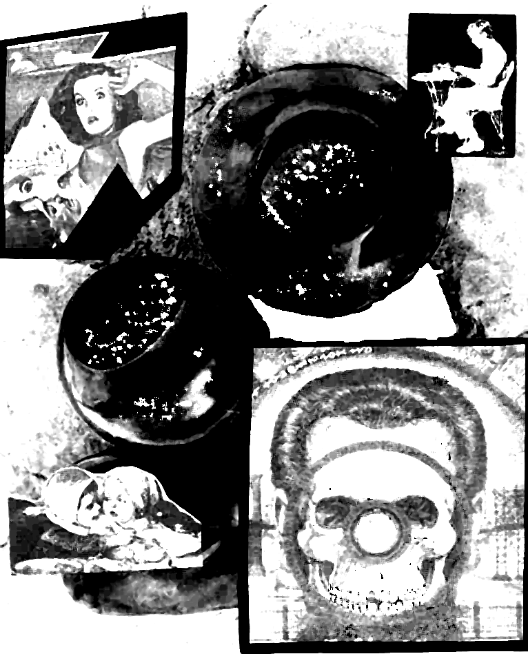 Sam Helm's MELVIN. Sort of. Sam created a collage, and this doesn't look much like a collage. We took his image, which was made mostly from glossy 4 color magazine illustrations, and we made it black & white, and played around with the contrast and the brightness until we got something we could repro. (The image in the magazine is considerably less... uh, nuanced than what you see here-- it was VERY high contrast, with almost no gray at all). We did this with Sam's permission, of course, but it still made us a little nervous. His original looked a lot different, as you can see if you click here. It's an immense file, though, so if you don't have a high speed connection or an inordinate amount of patience, you might want to skip it. Or just call Sam up and have him send it to you. That will probably take less time.
 One of ten drawings Paul Proch did to illustrate Richard Kostelanetz's '(Complete) Shorter Stories'in issue 69. All of Paul's effects were achieved with a pen and ink, and the magazine reproductions came pretty close to doing full justice to the originals, though here there's a bit of loss because of the file crunching.